All posts by admin-exeye

AVGTMP: A Program to Get the Average Temperature for a Location for Computing Degree Days

For many years I have been using the average temperature shown on my utility bill to compute the efficiency of my heating system, represented as fuel consumption per degree day. It’s an easy thing to do using a simple spreadsheet and it helps me judge whether improvements in things like insulation have made a difference. I’ll go into the details later in this post.

However, my utility recently redesigned my utility bill and stopped showing the average temperature value. I need that value, and spent a long time searching online for a source for such data. Finally I found a source, and used it to write a simple program called AVGTMP to download the data and use it to compute the value I need. I’m making the program available here.

Computing Heating System Efficiency

I heat with gas, which is measured in “ccf” (hundred cubic feet), so the efficiency value I use is “cf/DD” (cubic feet per degree day). It should be relatively constant over time. My gas bill is monthly, but the actual period varies by a few days from month to month. To be accurate, I need to consider the actual number of days in each period, and get the average temperature for only the days in the period.

My spreadsheet takes three values for a specific month: 1) number of days in the period, 2) average temperature for the period, and 3) gas consumption in ccf. Using those values I compute degree days for the period and consumption in cf/DD. It’s simple enough that you can easily create your own spreadsheet to do the same.

I use gas for other things like cooking and heating water, so there is a small baseline usage beyond what is used for heating. It’s small enough that I just ignore it.

Obtaining the Average Temperature Data Online

The key to making my AVGTMP program work was to find a source of historical temperature data for a specific location and for specific dates, that can be accessed through an API that would allow me to write a program to access it. I spent months looking for this, and finally found it, with a commercial data source at the website visualcrossing.com. It is a paid service, but they have a free tier of service that allows limited data download, which happens to be more than adequate for what I’m using it for.

To use AVGTMP, you need an account at Visual Crossing, which is free and easy to set up, and you need something called an “API Key”. Go to visualcrossing.com, sign up, select the free tier, and get your API Key. You’ll enter the key into AVGTMP later.

Installing AVGTMP

AVGTMP is a simple command-line program. That will take a little getting used to if you’re not familiar with such programs, but it’s easy. I didn’t want to spend the extra time to make a fancy GUI for the program.

Download the avgtmp.zip file from https://exeyesoftware.com/wp-content/uploads/2023/12/avgtmp.zip and unzip it. Ignore the “avgtmp.cs” file unless you’re a programmer and wish to see how it works, modify it, or use it for your own purposes.

The simplest way to “install” AVGTMP is to put avgtmp.exe in C:\Windows\system32, since that’s the folder you’re in by default when you open a command prompt. That’s not a clean way to do it, and if you’re an experienced Windows user, feel free to come up with something better. In what follows, it’s assumed that you’re in a folder where AVGTMP is accessible.

You need a command prompt window to run AVGTMP. I like to put a shortcut to the command prompt on my desktop. Or you can hit Win-X and pick “Command prompt” from the list.

Once you have a command prompt, type “AVGTMP” and you’ll see:


*** No API Key set!
    Data is obtained from www.visualcrossing.com.
    You must go there, create an account, select a plan,
    get an API Key, and enter it into this program, using this command:

    avgtmp -K mykey


AVGTMP - look up average temperature for a date range - 12/28/2023

To execute enter: AVGTMP zip start end

  zip is five-digit zip code of desired location
  start is start date
  end is end date

(Once you set an API Key, the first part of this message will no longer be displayed). Now would be a good time to get yourself an API Key and set it using the command shown in the message.

Using AVGTMP

Once you have the API Key set, run AVGTMP by using the command shown above. Use a 5-diigit zip code and start and end dates in any reasonable format. Enclose the dates in double quotes if they include blank spaces. You can leave out the year if it’s the current year. So for example:

   avgtmp 10927 6/4 6/9

will give you the average temperature for the six-day period from June 4th through June 9th of the current year for the zip code 10927:

   from 6/4/2023 through 6/9/2023 (6 days) average temperature is 60.02

There is error checking built into the program to catch many common errors, but not all. You may get hard-to-decipher messages in some cases.

About Periods

The periods that you specify include the end days. This may or may not correspond to what you need. For example, my utility bill might have a period of Nov 3 to Dec 6 which would call 33 days. They are measuring from the middle of the starting day to the middle of the ending day, roughly corresponding to the time of meter reading. AVGTMP measures from the beginning of the starting day to the end of the ending day, which gives 34 days. My opinion is that it’s close enough.

A Procedure for Managing Large Groups of Items, Such as Personal Property That Is Part of an Estate

Overview

A few months ago my mother passed away. This left me and my siblings with a large condo filled with personal property, much of it with value, either to us personally or monetarily. We needed a way to keep track of it all so we could:

  • make it available to each of us so we could indicate which items we were interested in keeping
  • organize the items none of us wanted (most of it) so it could be sold, donated, recycled, or otherwise disposed of
  • create a record of it all to have in the future for posterity, and to substitute for actually keeping things we are attached to but really don’t need

It was decided to inventory everything of value. We gave each item an item number and created a spreadsheet with information about the items. The spreadsheet has one row per item, with the item number, a description and other information, a place for each of us siblings to mark whether we were interested in the item, and pictures.

This has worked well for us. The spreadsheet has gotten quite big since there are thousands of items, but is still manageable, and it’s fairly easy to export a PDF of it which is easy to email, view, or print.

I’ve written a program to help manage the pictures in the spreadsheet. That makes it easier and quicker to add and manage items in the spreadsheet. More about the program (ADDPIX) in a section below, and in a separate post linked to from that section.

This spreadsheet format could be useful for many tasks involving the management and documentation of large groups of items. Examples would be such things as art, records, stamps, or other collectibles. There are no doubt many applications in business, such as an auction, where managing an inventory of things might be useful.

The Spreadsheet

I use LibreOffice’s Calc program. It works as well as Excel, is compatible with it, and is free. I urge you to give it a try. Most of these instructions will still be useful if you prefer to use Excel or another spreadsheet application.

The spreadsheet format has column headings in the first row, and item rows starting in row 2. There are no formulas or macros. The columns are:

  • Column A: Item# – formatted as MDnnnn where “nnnn” is the item number
  • Column B: Location – where the item is
  • Column C: Description
  • Columns D, E, F: JCC/ECH/JRC – where siblings (initials) can mark items they want
  • Column G: Est Val – value
  • Column H: Disposition – what to do (or has been done) with the item
  • Column I: eBay# – last four digits of eBay item number for listed items
  • Columns J, K, L, M: Pic1/Pic2/Pic3/Pic4 – up to four JPG images for the item

Detailed column descriptions and usage suggestions are in a later section of this article.

Columns can be added or deleted to match your needs. Be aware that if you wish to use my program (ADDPIX) to manage the pictures in the spreadsheet, you have to retain a few aspects of my format exactly, or be willing to do some fairly complex programming to adapt the program to your desired spreadsheet format.

Suggested Usage

This is how I use the spreadsheet: I have small stickers with item numbers on them to identify individual items. I prepare stickers in advance so it’s easy to stick them on items as I inventory them. While inventorying, I have a laptop open with the spreadsheet loaded. For each item, I attach a sticker, and enter the item description into the spreadsheet. I then take one or more pictures of the item. This process goes quickly. [I can provide stickers at a reasonable cost, as described below.]

As described, you start with each item row containing an item number, a description, and optionally a location and/or some pictures. All the other columns get filled in later, as needed, as part of the process of using the spreadsheet to manage your item inventory.

All this sounds like a lot of work, but it goes very quickly once you get good at it, and the results are worth it.

Adding Photos to the Spreadsheet

Occasionally (often enough so that I won’t forget which picture goes with which item), I download the pictures from my camera to an “Images” folder located in the same folder as the spreadsheet. I’m fussy about pictures so I take several shots of each final picture then delete all but the best one using Photo Viewer (see below). I then use an image editing program (I like “Paint.Net” – https://www.getpaint.net/) to crop each picture, adjust the image quality if necessary, and save it.

Images must be stored with a name of the form “mdnnnnx” where the “mdnnnn” is the item number (the first two letters are lower case), and “x” is a letter (“a” for the first picture, “b” for the second, etc.) specifying the picture sequence.

Note that you don’t need to scale the pictures before adding them to the spreadsheet; the spreadsheet program will store them actual size but can scale them to fit in the cell.

You can do it any way you like, of course, but following this pattern lets you use ADDPIX as is, or a modified version of it if you go that route. It’s also a good, and simple, way to keep your pictures organized.

To insert your pictures into the spreadsheet, either run ADDPIX if you are able to, or manually insert the pictures by clicking on the cell where the picture belongs and using “Insert Image…”. If you do this manually you will have to scale the pictures so they fit in the appropriate cells, by right-clicking on each picture and picking “Fit To Cell Size”. ADDPIX does this automatically, and also centers the picture in the cell which cannot easily be done manually.

Windows Photo Viewer

Windows Photo Viewer is a simple program that used to be included as part of Windows, but is missing from the latest versions of the OS. It’s actually still there, but there’s no easy way to enable it — you have to edit the registry to do so. Luckily people have created registry files to make the necessary changes. Search online for “enable Windows Photo Viewer” along with “Windows 10” or whatever version you are using, and you’ll find instructions and copies of the file(s) you’ll need. It only takes a minute, is safe and reversible, and you’ll end up with it on your right-click menu for photos..

I use Windows Photo Viewer to review the photos I’ve taken and delete all but the best ones. It’s easy and quick.

The ADDPIX Program

I’ve mentioned my ADDPIX program several times so far. I wrote it specifically for this job, and it makes the task of adding pictures to the spreadsheet very easy. I have a separate article specifically about the program at https://exeyesoftware.com/index.php/2023/07/23/addpix-a-sample-program-to-work-with-the-libreoffice-sdk-using-c-adding-images-to-a-calc-spreadsheet/. If you think you want to try ADDPIX, start by going to that article to download the zip file containing it.

Note that ADDPIX is a Windows command-line program that needs to be run from a command prompt. This is easy to do if you’ve never done it before; search for “how to run a Windows command line program” for instructions.

The linked article is primarily for programmers who want to use ADDPIX as a source of code snippets to be used in similar programs that they write. However, it has instructions for using ADDPIX, a detailed description of what it does, and a link to a zip file containing the program and a sample spreadsheet and images. It also has instructions for modifying ADDPIX (not for the faint of heart) should you wish to change the spreadsheet format and still be able to use ADDPIX.

If you want a modified version of ADDPIX but don’t want to learn to be a programmer, I can make modifications to it for you for a reasonable fee. I can also answer simple questions for free but I have to charge for complex assistance. Please contact me if you’d like more information or a quote.

Details of Spreadsheet Format

Earlier in this article I described the spreadsheet format in a summary form. Here I will go into more detail. You’ll need this information if you intend to use ADDPIX or want to follow my process closely. Of course, if you intend to come up with your own spreadsheet format, you are free to do so, and I expect most people will. This section may help you to do so effectively.

The spreadsheet starts with column headers in row 1. I like to freeze the column header row (instructions for doing so below) so it stays visible as you scroll, but LibreOffice (and ADDPIX) tend to lose this setting so you’ll have to keep doing it. It’s mostly important if you are going to print (or export to PDF) a copy of your spreadsheet.

Remaining rows contain data about individual items, one item per row. I use rows that are 1″ high, which gives room for small but useful pictures as well as detailed descriptions of items. Row formatting of text centers it vertically, and (mostly) centers it horizontally, with the option “Wrap text automatically” turned on. This lets you easily use multi-line paragraphs of text for the description and for other fields.

Individual Column Descriptions

Column A (Item#) contains the item identifying number. It is of the format “MDnnnn” where “MD” is a fixed string (it stands for “Mom & Dad”) to identify the types of items in the spreadsheet, and to make the item numbers recognizable as such. If you expect to use this format for multiple projects, you should choose a different two-letter prefix for each, for example the initials of the client. The “nnnn” is the actual item number. Usually you’ll start with “0001” and assign numbers sequentially, but you don’t have to, and don’t even have to have item numbers in ascending order.

Column B (Location) tells, of course, where the item is. There is room for a detailed multi-line description. It can include a room name, a box number, description of a specific place, a lot number, or whatever works for you.

Column C (Description) is the description of the item. Again there is room for a lot of information. As many of the items I inventory are destined for sale on eBay or elsewhere, I try to include everything I’d need to create an eBay listing, such as model number, manufacturer, specifications, condition, color, etc.

Columns D, E, and F (JCC/ECH/JRC) are used to record the wishes of the three parties with an interest in the items, specifically myself and my brother and sister, as indicated by our initials. For each item, we each mark a “-” if we don’t want the item, an “X” if we definitely want it, or a “?” if we are interested in it. Blank (” “) means that that person hasn’t made a determination. Once all three columns are marked, we can dispose of the item per the markings. Use whatever coding scheme works for you.

Column G (Est Val) is intended for recording value-related information when relevant. I use it for appraised value, eBay asking or selling price, and/or a guess at the value when that would be useful. There’s room for multiple values such as appraised value and selling price.

Column H (Disposition) tells your intention for what is to happen to the item, or what actually happened if disposition has been completed. For example, who got the item, where it was sold, to whom it should be shipped, or whether it was recycled or thrown out.

Column I (eBay#) is for identifying number(s) of potential or completed sale transactions. I use it for the last four digits of the eBay item number, which I find is sufficient to identify the transaction in my records (but which won’t help one find it on eBay). You can enter something similar, like an invoice number.

Columns J,K,L,M (Pic1/Pic2/Pic3/Pic4) are the columns where you put up to four pictures for the item. Pictures can go in any column, but you must suffix the picture image file name with “a” through “d” denoting columns Pic1 through Pic4 respectively. For example, a picture for item MD0123 to go in column K (Pic2) must be named “md0123b.jpg”.

You can use whatever headings you want for these columns and use them as you wish. You can use whatever codes you need in the columns.

Item Number Stickers

I suggest labeling items with small item number stickers. I typically prepare such stickers in quantity beforehand. I can print sheets of sequentially numbered item number stickers for you at a reasonable cost, as I have written a program to generate them quickly. Contact me for details.

Keep In Mind What You Will Do With the Spreadsheet

If you decide to add columns or change their width, keep in mind the overall width of the spreadsheet. It should stay as narrow as possible.

This is especially important if you need to be able to print it, or export it as a PDF file. When doing so, you’ll want to scale the output so that the entire spreadsheet width will fit on a single page width, probably in landscape mode. The scaled output should not be shrunken so much that it is hard to read and that the pictures are no longer clear.

Note that if you use a row height sufficient to be able to see the pictures stored in the row (I use 1″), you’ll have lots of room for multi-line text fields in the text columns. You can put a whole paragraph of information in the Description column, for example.

Changes you can make in the spreadsheet and still use ADDPIX

Some things need to stay the same to be able to use ADDPIX, but many can be changed. You can change:

  • column widths
  • row heights
  • cell formatting
  • column headings
  • the number of columns

You can’t change:

  • the item number format (“MDnnnn”)
  • location of the item number in column A
  • image file names (“mdnnnnx.jpg”)
  • number of images allowed per item (0-4)
  • location of the images in columns J-M
  • image file format (JPG)

Location of Spreadsheet and Images Folder if using ADDPIX

ADDPIX is written to expect the spreadsheet file to be “C:\ods-addpix\Sample_Items.ods” and the image files to be in “C:\ods-addpix\Images”. There are options to ADDPIX that let you specify the paths and the spreadsheet filename, so you can use what you want, and can set up a BAT file to add those options automatically to make it easier to run ADDPIX. The BAT file should contain (all on one line):

<optional path to ADDPIX.EXE location>ADDPIX %1 %2 %3 %4 %5 -ssh "<path and filename of spreadsheet>" -img "<path to image file folder>

It’s easiest to put ADDPIX, the ADDPIX.BAT file, the spreadsheet file, and the “Images” folder in the same folder. Then use “SHIFT-right-click->’Open command window here'” to open a command window in that folder. If you do this you don’t need complicated paths in your ADDPIX command.

Sharing the Spreadsheet with Others

At some point you’ll probably want to share your spreadsheet with others. You can do this by distributing the actual spreadsheet file, creating a PDF version, or by printing it out.

Formatting the Spreadsheet for Printing or Exporting

For the latter two choices, you’ll want to set up some formatting so the individual pages have the column headings, a header and footer, appropriate margins and portrait/landscape mode, and are scaled so the entire spreadsheet width fits on the page. The paragraphs below tell how to do this, because: 1) it is important, and 2) it’s very much not easy to figure out yourself.

These instructions are specific to the LibreOffice Calc program. If you use Excel or something else, you’re on your own, and the procedure will be different.

As you follow these instructions, use Print Preview often to check that you are getting the results you want. Select File->Print Preview and you’ll be able to see the spreadsheet formatted exactly the way it will be printed or exported as a PDF. This gives you a chance to get things right before actually printing anything. Exit the print preview by repeating File->Print Preview.

Here’s how to set things up for printing a nicely-formatted document. If you’re going to be distributing the spreadsheet itself to others, instead of printing it for distribution, the recipients will appreciate that you have taken the time to format it well.

  1. Freeze the top (header) row: A) select row 2 B) select View->Freeze Rows and Columns.
  2. Set the print range: A) select entire spreadsheet area (cells) that you want to print B) select Format->Print Ranges->Add.
  3. Turn on column headings for print range: A) select Format->Print Ranges->Edit… B) set the Rows to Repeat dropdown box to – user defined – and set the value to $1 (row 1). Note that freezing the top row of the spreadsheet won’t automatically do this for printing/exporting.
  4. Set the page width for printing: A) select Format->Page Style… B) pick the Sheet tab C) under Scale pick the Scaling mode: option Shrink print range(s) to width/height in the dropdown box. D) make sure the Width in page(s): box is checked E) enter 1 for the value (or whatever you want) F) uncheck the Height in page(s) box.
  5. Set page orientation: A) select Format->Page Style… B) pick the Page tab C) for Orientation: pick Landscape. This results in fewer lines per page but more readable text and bigger pictures.
  6. Set page margins: A) select Format->Page Style… B) pick the Page tab C) under Margins: enter whatever values you’d like. I like to keep margins small to fit more on a page, so I use 0.50″ or less for all four.
  7. Set page header: A) select Format->Page Style… B) pick the Header tab C) make sure the Header on box is selected D) Pick Edit… E) type the header text you want in the three boxes. I like to have the date on the left, a description in the center, and “Page n of nn” on the right. Use the buttons below the boxes to enter variable data fields — it’s pretty easy to figure out.
  8. Set page footer: just like setting the page header. I prefer to put everything in the header so I can leave off the footer. Just uncheck the Footer on box.

Sharing the Spreadsheet File Itself

You’ll want to share the spreadsheet file itself if you want others to be able to work on it. I do not recommend having multiple copies that people are working on, because if the copies get different from one another it is virtually impossible to merge the differences or even tell if they are different. But there may be cases where you’ll want to do this anyhow. Just be careful, especially if people are sending edited copies back to you.

The spreadsheet file can get very large, as much as several gigabytes for a moderately large project. So emailing it is probably impossible. Alternatives are a cloud drive like Google Drive, or a file-sharing service like FileMail.

Printing or Exporting a Copy of the Spreadsheet

In most cases you are better off making a PDF, which can often be small enough to email, or printing out the spreadsheet and distributing the printed copies. Be sure to follow the instructions for formatting the spreadsheet well, before doing so.

Before printing out or exporting a PDF copy of the spreadsheet, use Print Preview as described above. This gives you a chance to see what the output will look like, and get things right before actually printing anything. Printing a big spreadsheet or exporting a PDF can take a long time to complete, so you want to make sure it will be what you want.

To print the spreadsheet, use the familiar Edit->Print… dialog. Review the options you are given to make sure they are ok. Usually the defaults will be fine. Under More (which you may have to expand) you’ll find options for what to print, simplex/duplex, and number of copies.

To create a PDF of the spreadsheet, use the Edit->Export as PDF… dialog. You can go through the various option panes, but most of the time the defaults are what you want. When you’re ready, pick the Export button and you’ll be asked for a file name and destination folder for your PDF. Enter it, and exporting will begin.

Be aware that it takes a long time, especially for very big spreadsheets, that you get very little feedback that it’s happening, and that at times it will appear that it (and your computer) is hung up. If you’re not sure it is working, go get a cup of coffee or something for a while.

A warning: don’t try to use a PDF printer driver to “print” the PDF. Doing so will add a layer of unwanted formatting to your output, and you’ll probably not get what you want. Using Export as PDF guarantees that you’ll get what the Print Preview showed you. (or it’s supposed to).

Printing Sections of the Spreadsheet

You may find it valuable to print or export a section of the spreadsheet rather than the whole thing. For example, I do this when I add a number of new items to the spreadsheet and want to send just those items to my brother and sister for review. A PDF of my whole spreadsheet is over a hundred pages; by exporting only the new items I can send them a short PDF for them to review.

The first step in printing/exporting a portion of the spreadsheet is to select the cells you want. It doesn’t work to select the rows you want; you have to select the exact block of cells to be printed. Note that the Row 1 header shouldn’t be selected; it will appear as the first row on each page if turned on in Print Ranges. Also note that you have to select a contiguous block of cells; it doesn’t work to pick blocks of cells from various places.

Don’t try to use File->Print Preview to see if the selected area of the spreadsheet will be printed correctly. Print Preview always displays the full spreadsheet; worse, it deselects the section you’ve selected. However, the Print Preview box in the Print dialog will correctly show you the selected cells that will be printed.

If you are printing the selected part of the spreadsheet, pick File->Print… as usual. In the General tab of the dialog, make sure the More section is expanded, and in the From which: dropdown box, pick Print Selected Cells.

If you are exporting a PDF of the selected part of the spreadsheet, pick File->Export as PDF… as usual. Under the General tab, in the Range section, make sure that Selection/Selected Sheet(s) is checked.

ADDPIX: A Sample Program to Work With the LibreOffice SDK Using C# – Adding Images to a Calc Spreadsheet

I’ve spent the past few months trying to get a C# program written which uses the SDK to read cells from a Calc spreadsheet and read/write/modify images “in” cells. I got a lot of help in the LibreOffice forums and elsewhere for which I’m very grateful. At first I was told that it wasn’t possible, but that just made me determined to figure out how to do it, and I finally did. It took many times the amount of time that the program will end up saving me, but hopefully it will be helpful to others trying to do similar things.

Background: The Original Task

This task arose as a result of my mother passing away and leaving me and my siblings with a large condo full of things that needed to be disposed of. We sorted out the things of sentimental or monetary value, assigned item numbers to them, and put them in a spreadsheet to facilitate distribution to us siblings as well as disposal of things that none of us wants. The spreadsheet includes pictures of the items, and adding and maintaining those pictures ended up being a lot of work. There are thousands of items.

I have another post on this website (https://exeyesoftware.com/index.php/2023/08/09/a-procedure-for-managing-large-groups-of-items-such-as-personal-property-that-is-part-of-an-estate/) which describes the task in detail, and which is intended for people who have a similar task (disposing of an estate) and wish to use ADDPIX as is or with minor modifications.

The ADDPIX Program

The program ADDPIX works with the spreadsheet format that we used for the task of maintaining those pictures. It can add new pictures, delete pictures, refresh pictures with new copies, and adjust the size and position of images so they fit and are centered in their cells. As is, it is very specific to this task and spreadsheet format. It would only be useful in its current state to someone facing a similar task of inventorying, documenting, and disposing of a large number of items and willing to use the same spreadsheet format that I used. However, it would be very useful as a source of code samples to someone writing a program to work with Calc spreadsheets using the LibreOffice SDK.

ADDPIX is a command-line program and displays messages in the console window, but does not have a GUI or display the LibreOffice window.

The ADDPIX program is written in C# and is easy to understand, modify, and compile. Detailed instructions for doing so are in the ADDPIX package (“addpix.zip”), in a file named “addpix.txt”. You’ll have to modify the program if you want to make changes in how it works, such as adding columns to the spreadsheet or changing the naming convention for items and images.

Using the Code in the ADDPIX Program

ADDPIX is a complete, working program that opens a LibreOffice ODS file containing a Calc spreadsheet, and:

  • reads cell data
  • inserts, deletes and modifies images “in” cells
  • saves the modified spreadsheet
  • closes it and its instance of LibreOffice

Note that images are not located “in” cells but are placed on a graphic overlay (a “DrawPage”) that is associated with a spreadsheet sheet. To the user, it appears that images are inserted into cells, but internally that is accomplished with a lot of complexity. This makes working with images programmatically quite complex, which is why ADDPIX is a valuable contribution to the relevant sample code base.

There are a number of bugs in LibreOffice itself involving the manipulation of spreadsheets that contain images. I’ve been reporting them as I find them and slowly they are getting fixed. ADDPIX can help identify and fix some of the problems caused by these bugs. The bugs I’ve identified so far involve the linkage between images and cells and occur when doing things like copying and pasting cells, rows, and columns containing images.

The various tasks that ADDPIX does to manipulate the spreadsheet are delineated in the code with comments to make them easy to find and copy into your code. The C# code itself is linear and simple so it is easy to understand and so the parts that do various things are pretty much independent.

Included in the ADDPIX package (“addpix.zip”) is the source and executable, a sample spreadsheet with associated sample images, and a text file (“addpix.txt”) with a detailed description of the program: what it does, how to use it, how it works, and how to use it in your own code.

Download the ADDPIX package from addpix.zip. Unzip it into “C:\ods-addpix” so everything will work as supplied.

I hope this proves useful to others.

Programmers and Web Developers: Make Things Easy and Fast for Your Users

I’ve been writing software for over 50 years and have evolved a set of rules for designing user interfaces that are easy to use and which allow users to get their work done as quickly as possible. These rules apply equally to desktop applications, apps, and web pages.

I don’t know what they’re teaching in user-interface classes these days, but software today is, as a rule, dreadful. It is extremely painful for me to use since I see glaring design failures at almost every step. Clearly, the rules people are learning are inadequate.

Users, as a rule, are used to abysmally bad software, and don’t complain about it so long as there is a way to get what they need to do done. The standards by which users judge software are extremely low. Most users have never encountered software that is a pleasure to use.

The rules in this article are intended to make developers think about the things that can produce software that is in fact a pleasure. Many of these things involve thinking deeply about development choices that are typically made with little or no consideration.

Many of our rules are intended to reduce the number of steps needed to accomplish something. That basic principle is, in my opinion, at the root of good user-interface design. I think that the focus these days is on appearance, but appearance should be secondary to function, which is not to imply that you have to sacrifice aesthetics to achieve ideal functionality.

Focus, in most development work, is also on getting things done rather than doing them right. Yes, developers have to meet deadlines, but it often takes very little extra effort to explicitly think about the choices you make. You’ll also find that by focusing on quality over speed, you’ll reduce the overall time that a development task takes, especially when considering things like documentation, user support, maintenance, and rework.

Here are some basic rules:

Eliminate Unnecessary Steps

Every step in a multi-step process should be examined to see if it is absolutely necessary. Consider this solely from the point of view of what the user is trying to accomplish, not from how the software is designed or what is easiest to program.

Make use of defaults and persistent settings to eliminate steps related to options. Often an operation that needs to be repeated uses data from the previous operation. Make it easy, or at best unnecessary, to enter duplicate information. For example, use something like Ctrl-D to copy the previously-entered value from a field, or default to the previous value if appropriate.

Very often a multi-step process can be reduced to one or two steps by careful design. This can greatly increase the speed at which users can get their work done, and make them much happier.

Be Judicious in the Use of Security

Most programs and websites are accessed from insecure computers, and don’t involve information that has huge consequences if access to it is compromised. Also, many people use password managers which automate logins for anyone using the computer. The security of even the most sensitive information is usually determined solely by physical access to the computer.

So probably most users just find it annoying (and completely unnecessary) to have to log in to most things each time they are used. Avoid the need to log in, or have an option to stay logged in. Consider Amazon, which has moderate consequences if an unauthorized user gains access — they keep you logged in pretty much forever. They want it to be easy to buy things, and having to log in repeatedly makes it less easy.

Eliminate Most “Are-You-Sure” Dialogs

Few things are more annoying than being asked “are you sure?” after you’ve already indicated that you want to do something. Some software does this for almost everything you do, and in most cases it is completely unnecessary.

The key question to ask is: what are the consequences of making a mistake here? If a mistake will cause significant work to be irrevocably lost, yes you should ask. But if the cost of recovering from a mistake is low, you don’t need to ask. Compare that cost with the cost of having to answer “yes” in the vast majority of cases.

If you still think you should ask, see if other design changes could eliminate or reduce the need for the dialog. For example, a “restore” or “undo” option would do the trick. Often the best solution is a multi-step “undo” function that will undo everything one step at a time. A special case is exiting without saving your work, and even that can be overcome by automatically saving the changed data in a temporary file before exiting.

Make the Most Common Next Step Easiest to Do

Most programs are used in predictable ways. Frequently there are sequences of steps that repeat often. Make the path through that sequence as straightforward, and as short, as possible.

Make the thing most likely to be done next the easiest to do. Minimize the movement necessary to accomplish it, for example by putting targets closer together. Don’t display targets that are inactive or irrelevant.

The classic example of failing to follow this rule is websites that have a search box, like the Amazon site. The first thing most users want to do is type something in the search box. But first the user has to click in the search box to get the cursor there. If the site came up with the cursor already there, the user could just start typing. There’s no reason I know of why that isn’t done; it doesn’t mean the user has to do more to click on something else if he doesn’t want to search. Worse, many people (like me) assume that they can just start typing, and they type a bunch of stuff before realizing that nothing is being entered.

So, if a screen comes up with a box to type into, and putting the focus on that box doesn’t add extra steps to other things, by all means put the focus there. The only exception I can think of is when the most likely next step is to scroll the page, in which case the focus might ought to stay on the page.

Minimize the Use of Icons

The most recognizable icons are words. Use them. How many times do you have to move your cursor over a series of icons to see the text that pops up? Eliminate that annoyance by just using words instead. People don’t remember any but the most recognizable and frequently-used icons, so they just slow down their work and increase errors.

Yes words often use more space on the screen. Good design will compensate, and will reduce clutter. It also helps to only display functions that are relevant to the current state. It also matters greatly what specific words you display.

Choose Words Very Carefully

It is extraordinarily important that you use the clearest wording possible. This is especially critical when naming functions or targets, where names need to be both clear and short.

In the 70s and 80s I was the lead designer of a CAD system that ended up being the main product of a 100-person company and which generated hundreds of millions in sales. The tag line for it in ads was “It’s Easy!”, and it was. When we named functions and targets for that product, there was often a meeting, sometimes a long one, just to come up with be best word to describe a single function. That’s a big reason it was, in fact, easy.

Messages, especially error messages, need also to be very carefully worded. When you are composing a message, think carefully about it and about how others might interpret it.

Button wording is also important. Stick with conventional words like “OK” and “Continue” when appropriate. Be very careful to avoid words with ambiguous meanings. When a button does something, label the button with what it does. Always use the same word(s) to describe the same function.

Trying Things Should Be Without Risk

It is common when learning a new program or website for a user to be unsure how to accomplish what he wants to do. You should of course make things as obvious as possible, but you also want the user to be able to try things without having to worry that picking some target will do something irreversible. Every target when picked should have a clear way out that 1) doesn’t make any changes, and 2) returns the user to where he was when he picked the target.

It takes thought and effort to make this true while also eliminating extra steps needed by a user who knows what he’s doing to get his task done. If your application is amenable to a universal “undo” function, that is an excellent way to accomplish this goal.

Few things are more frustrating, and are as likely to make a user hate (and reject) your software, as picking a target and having it 1) not do what he expects, and 2) do something irreversible or without a clear way to undo it. Worst is when something happens and it isn’t clear what was done.

Unsure? The User’s First Guess Should Be Right

This one is tricky, and is a good test of your ability to consider how a user relates to your software.

When a user is unsure of what to do next, their first guess should be the correct one. Implementing this requires that you be sensitive to the things in your interface that could be confusing, and your first effort should be to change your interface so that the ways to do all the things a user might want to do at any point are easy and obvious. That’s rarely practical in real life, but the fallback effort should be to design the choices available so that, no matter what the user might want to do, his first guess is most likely to be the correct one.

Thinking about things in this way will greatly increase your appreciation and understanding of how users relate to your software, and can make a big contribution to your ability to create easy-to-use software that will leave your users happy.

Optimize for Experienced Users

It’s important to consider the needs of beginning users, but nothing you add to help beginners should add steps for, or otherwise slow down, experienced users. If your software design is successful, the vast majority of time spent using the software will be by experienced users.

A great design will be easy to use by beginners, without the need for adaptations specifically for them. They’ll start out knowing nothing, but their first guess as to the next step to accomplish what they want will be correct.

Sometimes aids such as “cheat sheets” or keyboard overlays can provide helpful guidance for beginners when design limitations prevent making things obvious to a new user. For example, I helped design a text editor which was well-liked and had enthusiastic users. It was entirely keyboard-driven, with nothing on the screen except the text being edited. Clearly, a new user would be lost, but we provided a keyboard overlay with the editor which labeled each key with the function it performed. That overlay, combined with function design which emphasized simplicity, and well-chosen function names, made the software quick and easy to learn.

“Undo” is Your Friend

“Undo” is obviously important to correct mistakes. But it also changes a user’s relationship to the software: because when it is easy to undo an action, it makes it possible to try things without consequence. Users, especially new ones, can thus work quickly and fearlessly.

A good “Undo” function is usually hard to implement, but in many cases is very much worth the effort. The user should be able to undo multiple actions. If appropriate, he should be able to undo back to the beginning. Incomplete “Undo” functions that will only undo some actions will mostly serve to irritate users, and those that will only undo one step back are nearly as bad.

Rational program structure will often simplify implementation of “Undo”. If there is common code at the beginning and end of each action that changes anything, you have a place to do the things needed to support “Undo”. Put some time into cleaning up your code before trying to implement :Undo”.

An “Undo” function does not make sense for every program, and often only makes sense for actions taken between obvious demarcation points. For example, a program which prints address labels might reasonably break the undo chain when a label is printed. An important caveat, however, is that the software designer shouldn’t limit undo actions because some are hard to implement. It’s often the case that the ones that are hardest to do are the ones that provide the most value to the user.

Seldom-Used Functions

Very often a program has a small set of functions which are used constantly, and a much larger set of functions which are seldom if ever needed. A considerable effort should be made to design the screens where the user will spend the bulk of his time so maximum screen real estate is devoted to functions he is likely to need, and the absolute minimum is used for special cases.

Screen space is extremely valuable. It is desirable to make access to functions which are seldom or never needed a multi-step process. This gives more room to display data and status related to what is being worked on frequently, and to use the available space to reduce the steps needed to accomplish things.

It’s perfectly ok, in fact highly desirable, to add steps to what needs to be done to gain access to seldom-used functions. The overall goal is to reduce the number of steps that the user has to go through to get his job done. Adding multiple steps to something that is rarely done is justified if it allows you to eliminate one step in a process that is done over and over.

More about how to accomplish this in “Menu Design” below.

Modes

Most programs are modal but developers often do not think in those terms. Programs differ in the strictness of their modality. A well-designed program will have strictly-defined modes with a small amount of screen space devoted to switching to other modes, and most of the space devoted to the mode’s task itself.

Most programmers use modularity in their program design, but often without thinking about it. They fail to divide the program’s functionality along clean modal lines, or include the right set of subfunctions in each mode.

To get modality right, you must think clearly about what task the mode is intended to accomplish, what steps are needed to accomplish it, and what options apply to it. In many cases the mode’s screen can be organized for the entry of necessary values in a conventional or rational sequence. Group optional values or settings by type or function.

Often there are subfunctions or groups of subfunctions that are included in multiple modes. They should always work exactly the same way (ideally by being the same code) everywhere they appear, and be positioned and grouped exactly the same in each mode in which they are included. When there is a group of related subfunctions, it often helps to give the group a name, which is displayed onscreen as well as in documentation.

Menu Design

Everyone designs menus so everyone should be good at it. Why then are so many menus so hard to navigate?

It takes a lot of work and thought to design a good menu. There are a lot of rules, and often they are conflicting. The overarching consideration is that the menu organization should make sense and it should be easy for the user to grasp the underlying structure.

Functions should be organized by type. Frequently used functions should be easiest to get to. When you’re in a function, the functions you’re most likely to need next should be the easiest to get to, and part of that involves minimizing the distance the user will have to move to get to them. Sequences that require switching between the keyboard an the mouse should be minimized.

Well designed menus frequently have several levels of submenus. Deeper levels should be used for increasingly infrequently-needed functions. The functions on a given submenu should be related. It is bad design to give the user too many choices on a single screen — avoid complex, cluttered menus, as well as excessive simultaneous menus.

No matter what the user wants to do, there should be a function to do it, and at each menu level the user should be presented with a set of functions or function categories such that the choice that gets him closer to the function he needs is clear. Getting this right takes planning, including the consideration of multiple prototypes, and a lot of careful thought.

There are a number of types of standard menus that should be used where appropriate, since users are familiar with them. These include settings menus, three-dot menus, help, and other standard menu types. Consider how a user is likely to categorize what he wants to do to when deciding where he is most likely to look for the function he wants.

Three-dot menus in particular are a good place to put access to less-frequently-needed submenus. Think about where and why the user will end up looking in the three-dot menu for what he’s trying to do.

It’s usually best to avoid multiple paths to the same function. Putting access to a function in multiple places tends to increase the complexity of the menu system without significantly reducing the number of clicks required to complete a task. If you are tempted to put access to a function in multiple places, consider whether that function would best be accessed from a higher-level menu, or whether you’ve come up with the best allocation of tasks to functions.

Entering Formatted or Repetitive Values

A glaring design error found in much software is a data entry field that rejects “improperly formatted” values when the intent is clear. Things such as social security numbers, and phone numbers are example of these. Users should be able to enter the requested data in any format that is unambiguous, and the entry should be reformatted automatically as needed on leaving the field. Programmers should have a set of functions prepared that will reformat each of the values that they regularly encounter.

An example of this is is the entry of a date value. Regardless of the format used to display the value, the user should be able to enter it using any format desired. Examples are 7/26/24, 07/26/24, 26Jul24, 26 July 2024, or July 26 24. There are no doubt others. Consider also the locale; in some places you would use 26/7/24, and this affects both interpretation of entered values and display of formatted values. Modern programming environments have easy ways to look up which format is correct for the current locale.

Drop-down boxes should be used with care. They require the user to switch from the keyboard to the mouse which is disruptive and time-consuming, and also often prevents auto-fill provided by things like password managers from working correctly. A particularly egregious example of this is the entering of state names, where only two characters need to be typed. If you feel that you must use a drop-down box, set it up so the user can also type the value. Many programmers use drop-down boxes to ensure that the entered value is a valid one; it’s much preferable to simply check the entered value when the user is done entering it. That is a bit harder to program; however programmer laziness should never result in software that inconveniences or slows down the user.

While dropdown boxes are best avoided in many cases, it’s often helpful to use drop-down boxes populated with all previously-used values for a field, especially when those values are not short. The user can pick a previously-entered value or enter a new one. “Previously used” might include just the current session, or previous sessions; if previous sessions are included older unused entries should be dropped after a period of time.

A variation of this that is commonly used is having fields autocomplete based on previous entries. This can be tricky to implement well — study how other programs do it.

If you need to check an entered field for validity, do it upon leaving the field. It is annoying and disruptive to check on each character entered. Doing so usually means an error is displayed when the only error is that the software hasn’t waited for typing to be completed.

Keyboard vs Mouse

Badly designed programs frequently require the user to switch between the mouse and the keyboard, which slows things down (a lot) and annoys users. Situations which require switching should be minimized. It’s often possible to map functions to both input methods: consider “Right-Click->Copy” and “Ctrl-C”.

Generally, keyboard input is faster. However, it suffers from requiring the user to remember sometimes obscure key sequences or combinations. This can be helped by using mnemonic key combinations (like “Ctrl-C”). But there are few good ones available and the operating system or browser may have already consumed most of them. Frequent users can learn the ones most useful to them, but the learning curve is steep and few users do.

This can be helped by providing users with a simple “cheat sheet” or keyboard overlays or maps. Key combinations can also be shown in menus and on targets, as Windows does in some (but not enough) places.

Another consideration is whether to override predefined keys and key combinations with ones specific to your program. It’s often a good idea to take over many of them, but some, such as “F1” for help, should be retained. This is another area where the overall design needs to be carefully worked out, with considerable thought.

Look at the “Optimize for Experienced Users” section for more about this topic.

Program Errors

It seems that the convention for finding program errors is to write programs full of “debug” statements, and then to turn off the debug checking for release builds. The result is that internal errors that occur in production programs will cause crashes or malfunctions when something goes wrong. I’m a strong believer in having release builds contain extensive internal checking and that even release builds report such errors when they occur. Internal errors should be reported even when they’re not catastrophic — having software doing stuff that is not what was intended is a recipe for flakiness.

I realize that it is politically bad for programs to report internal errors. My response is that doing so makes it possible (and easy) to identify and fix bugs. Overall, users will see less bad behavior from programs that report errors than from programs that don’t, since bugs will get identified and fixed early. If marketing types try to get you to hide malfunctions, fight.

There are many ways to record and report internal errors. The simplest of course is to just display a message and exit. With a little more work, error details can be recorded in the Windows application log or elsewhere. What is essential is to see that errors that occur get reported to the developers. Ideal is an email or other message to the developer.

It is also very important to report the error in an identifiable way. Reports should identify the error explicitly, and include a call stack. The way I do it in simple programs is to have an error reporting function that does this and which then terminates the program. A call such as “gterm(“func3″,123)” produces a message like:

Terminal error FUNC3 123
app->func1->func2->func3>gterm

which is generally all a developer needs to identify where and why the error occurred as well as what the user had done to cause it to occur. All calls to the GTERM function contains the name of the function in which the error occurred, and a number unique to the call which identifies exactly where (and thus why) the error occurred. Depending on the error-reporting capabilities built into the language or environment you are using, much or all of this may happen automatically.

If you write highly structured code this reporting technique may not be sufficient, in which case you might want to add information about classes and such to the call stack information. Also, if you make extensive use of third-party libraries, you may need to find ways to deal with their opaque nature, perhaps by writing wrappers for the library functions.

You can use similar techniques to report unhandled exceptions.

In complex or critical programs, terminating the program on every error will probably not be acceptable, though you may be surprised at how rarely it happens when 1) encountering an error is painful, and 2) error messages give sufficient information to identify specifically what caused the error. Terminating the program strongly motivates users to report errors and developers to fix them.

Whatever method you decide on for handling errors, it must result in all errors being reported to the developers with sufficient identifying information, and developers must promptly address all reported errors. If you do this, errors will be few and far between.

Implicit in all this discussion of errors is extensive internal checking, for example of values for things like null or something out of the expected range. Nowadays languages tend to throw exceptions for basic things like bad subscripts, but there are always ways for things to go off the track, and you should get in the habit of thinking of, and checking for, all of them. Your programs will have lots of checking, but they’ll work. Extensive error checking adds code to your software but generally does not slow things down materially.

Emphasize These Rules when Managing Developers

Most developers who work on software work against a specification. These specifications typically describe functionality and often include details relating to appearance. What is uniformly lacking is an implicit emphasis on optimum usability.

All specifications should include language about maximizing ease of use, minimizing user effort, and making things as clear and understandable as possible. A good way to do this is by referencing a detailed usability standard, similar to what is in this article. Consider creating one.

Developers should aim higher than just cranking out something that will satisfy the specification. Every development decision, especially the small ones, should be evaluated to consider alternatives and analyze which of those alternatives will yield the best result for the user. The small things matter, a lot, if you want to have users who love using what you write, rather than just not complaining about it.

Improving Production Software

Bad software is everywhere, and all software can be improved. However when you have a user base for bad software that you want to improve, you’re left in a quandary. Users don’t like changes, and major changes requiring significant relearning are enough to get users to consider alternative products.

There is something called “the baby duck syndrome” which applies here — the first thing a baby duck sees when it comes out of the shell it considers to be its mother. Likewise, users get attracted to the first application they learn for a specific task. Curiously, the attraction is strongest for the hardest-to-learn software, basically because users don’t want to have to go through that painful learning process again. Consider AutoCAD or Photoshop.

If you need to improve bad software, you can either make incremental changes over time, or release a new version incorporating major improvements. Both alternatives have advantages. Either way, if the updated software is designed well enough, users will adapt to it smoothly and quickly.

Note that even in a production program, the vast bulk of the program’s functionality is rarely used. Even radical redesign to such functionality is possible with little or no effect on the user. And seldom used functions are some of the ones where improvements can have the most benefit, especially things that make it easier and safer for users to find their way in parts of the program they’re unfamiliar with.

Some software is used to automate workflows, often in a production environment, and extra care needs to be taken not to break important processes. With thought and care, major improvements can still be made without undue disruption. Remember, and make clear to your users, that adaptations they must make are intended to help them work more efficiently, and will be well worth the trouble in the long run.

Develop on Modest Hardware

Many users have minimal hardware: slow computers, limited memory, single monitors, and slow internet. Similarly, many smartphone users have $250 phones and slow and spotty internet connections. If you develop software on top-end machines and environments you will produce software that doesn’t run well for most users.

There is a tendency to use the rationale that software development is expensive so it pays to use the best hardware to do it. Unfortunately that only makes sense if your users are also going to have equivalently high-end hardware. Doing your development on consumer-level hardware will cost you more time, but less than you think. And you can use the few seconds here and there that you spend waiting, to think about how to make things work faster and more smoothly for your users.

Don’t think that having a slow machine available to test software will be enough. By the time the software gets to that point it will be too late to improve it. And your testers will have the attitude that unusably-slow software on a slow machine is acceptable.

Mailing & Shipping 101: Packing Items Safely and Considerately

This article is about two things: how to safely and efficiently pack items sold on eBay (or elsewhere), and how to pack things with some consideration of what the recipient will have to do to get the item out of the packaging.

I got motivated to write this because I’m good at packing things (I’ve sold many thousands of things on eBay and Amazon, including lots of big and heavy things like printers, and have only had one item suffer minor shipping damage), and because I’m sick of receiving things I’ve ordered on eBay wrapped in way too much packaging and tape making them nearly impossible to remove from the package.

I will try to help you answer two questions:

  1. Did I pack my item so it will arrive safely?
  2. Did I make it as easy as possible for the recipient to get the item out of the package?

Both are important!

There are several links to Amazon in this article. I don’t get referral fees for them.

Do You Need a Box At All?

You may have noticed that Amazon uses fewer and fewer boxes for their shipments. They are realizing that poly bags and poly bubble bags provide enough protection for many items, are cheaper, and are much easier to pack and for the recipient to open.

I sell a lot of small stuff, and use #0 poly bubble bags (10″ x 7″) for most of my shipments. They are well under 20¢ in quantity (buy them on eBay), and I can pack, label, and seal them in seconds. For bigger things I use #2, #4, and #6 bubble bags.

For larger items, things already in (small) boxes, and clothing, poly bags (non-bubble) are a good alternative. They are quite strong and are also easy to pack, and they take up little space so you can stock a range of sizes in a small space. I use them for things that are too big for the bubble bags I stock. They’re also cheap, at least in smaller sizes.

For shipping things that shouldn’t get bent, like printed material or fragile things like memory sticks, I use corrugated pads (flat sheets of cardboard) as reinforcement. You can cut them from boxes you don’t need, but it’s easier and better to buy them pre-cut. Again eBay is a good source. Look for “32 ECT” to get heavier-duty ones, and avoid anything labeled “EcoSwift” as they are very flimsy and lightweight. Cut pads as required to fit the bubble bag you’re using, put the item being shipped in a ziplock bag, and tape it to the cardboard, or use rubber bands to hold it in place. It is often a good idea to use two pads taped together with the item sandwiched between them.

I buy 8.5″ x 11″ pads, and cut most of them in half. If you don’t have a paper cutter to do this, buy one. They are an essential tool. Half of an 8.5″ x 11″ pad (5.5″ x 8.5″) fits perfectly in a #0 bubble bag. At least 75% of what I sell is packed this way. It’s very good protection, and very easy to open.

Using Boxes
Some of my saved boxed. The stickers have inventory numbers and I have a spreadsheet that says what size they are and where they are stored.

You’ll need to use corrugated cartons (boxes) for big, heavy things, and for things that might punch through a bubble bag. I save old boxes, have hundreds of them, and have a complicated system to inventory them so I can quickly choose the right size box for a shipment and then find it. I will write up my system some day and post it here, even though it will only be of interest to the truly obsessive.

USPS boxes and padded mailers are great, and are free. Don’t misuse them! I worry that so many people are misusing such packaging supplies that the USPS will have to start charging for them, or discontinue them entirely. When I get a package from someone where there is egregious misuse of free USPS supplies (such as using copious padded mailers instead of bubble wrap for padding), I report them to the USPS, and you should too. I got one big box a while back that was pieced together from a number of USPS boxes, had literally dozens of padded mailers inside, and to add insult to injury, was shipped by FedEx Ground!

If you sell the same items over and over, consider buying boxes the right size for shipping them. Again, eBay is a good source. For smaller things, look at boxes called “mailers” which are ones that fold up from a flat sheet of cardboard and are often white. They’re nicer, and sometimes cheaper, than the typical boxes with flaps.

If you ship heavy things like printers, buy some 1″ white unfaced Styrofoam sheets. You can get them at lumber yards, and a 2′ x 8′ sheet should cost about $5. Neither Lowes nor Home Depot has them. There are other types of insulation that are much more expensive, so be careful, and shop around if necessary. I buy them 10 at a time.

Cut the 1″ styrofoam with a serrated knife, or if you have one, a table saw. Cut it 1/4″ or 1/2″ shorter than you think you’ll need. Use one or two layers on all sides of the box. Start by putting one or two layers on the bottom, then do the sides, then the top. If the item you’re shipping is not square-sided, fill the extra space with packing material like air pillows or packing peanuts. If you do it right you’ll end up with a nice, solid, strong package.

When taping boxes, use the “H” pattern. One long strip down the middle of the flaps and extending halfway or more down the sides of the box, then short strips along the sides of the flaps. Make the short strips short enough that there is a little space at the edges to get a knife in. Tape both the top and bottom of the box the same way.

If you’re packing something heavy, or just need extra strength, wrap strapping tape around the package in several places.

Supplies You’ll Need

There are a few things that make packing stuff a lot easier. First, get a good tape dispenser and good-quality packing tape. Next, buy a strapping-tape dispenser and a few rolls of strapping tape. Also very handy is a stapler for corrugated boxes; I use an Arrow P-35 stapler with 3/8″ staples.

Good-quality packing tape is hard to find. The cheap stuff is mostly no good, and the brand-name stuff is way too expensive. I recently bought some Amazon Basics tape and found it quite good and reasonably-priced. Go to https://www.amazon.com/gp/product/B08D4K9DLM/.

There are several different kinds of packing tape dispensers. The kind I like are the simplest ones; if it has a handle, it’s too complicated. Go to https://amazon.com/dp/B0000AQOJB/.

I’ve had good luck with cheap strapping tape. I get this stuff for about $6/roll: https://amazon.com/dp/B01LY3BPZZ/. And for strapping-tape dispensers try https://amazon.com/dp/B000QDRRNY/ which is a nice steel one for about $13.

There are several models of the T-35 stapler. They don’t make the one I use any more but the best comparable one is https://amazon.com/dp/B000KNHVMM/. It has a spear point which makes it good for stapling closed box flaps. While not the preferred way to close boxes, there are times when it’s handy.

Buy or Recycle?

Some things, like tape, sheets of styrofoam, or bubble bags, you’ll have to buy. It also makes sense to buy boxes if you need lots of a specific size. Most of the rest of what you’ll need for packing things will come as the packaging you’ll get from others, if you make a point to save it. If you sell stuff, it stands to reason that you buy stuff, plus most of us get lots of what we need from places like Amazon, and it all comes in packages containing lots of packing material.

Packing peanuts
Packing paper and air pillows

I buy large plastic trash bags and use them to store packing material. I actually end up saving more packing material than I need. When I get too many bags I’ll take a few to my local pack-and-ship shop, which they appreciate, and reuse.

Making Things Easy for the Recipient

Note the word “considerately” in the title of this post. This refers to making things easy for the recipient of the package. Too many things I buy on eBay arrive encased in armor and take a lot of time-consuming work to open. Sometimes it’s even hard to get the item out of the packaging without damaging it. You don’t need to mummify the internal packing material (or the outer box) with packing tape in order for it to arrive safely. Use just enough tape to hold things together securely.

If you wrap an item in bubble wrap, often you don’t need to tape it in place at all, or it can be secured with a single small tab of tape. If it’s pretty snug in the package, the item will stay secure in the bubble wrap without any tape. A very good alternative is to use rubber bands.

Tape the box flaps using the “H” pattern described above. You don’t need to overwrap the entire package in tape.

If you use Priority Mail packaging that has self-seal strips, the strips are plenty strong. You don’t need additional tape. The only exceptions are when the box is old and the self-stick glue has dried out, if you’re jamming something big in the box (yes we all do it and it’s legal if the flaps will close somehow) and the flaps don’t quite close securely, or if you’re shipping something extremely heavy.

For most all uses of packing tape other than closing boxes, such as taping things closed on printers or securing bubble wrap around an item, be sure to fold back a corner of the tape to give the purchaser something to grab. It’s really difficult to remove the tape otherwise, and many people don’t have fingernails suitable for the task.

If you use styrofoam sheets or packing peanuts (or anything else that’s messy), be sure to put the item you’re shipping in a plastic bag first. Don’t make your recipient have to spend a lot of time picking bits of styrofoam off of or out of their item.

Sharp, Pointy, or Heavy Things

It is necessary to use extra protection with things that could punch through their container. You need to get creative. Stapled-together cardboard sheets, or wood of various sizes, can be useful in crafting a package that will ship a heavy item safely. Crumpled brown-paper sheets also provide a surprising amount of security.

For example I sell steel rock chisels that are an inch in diameter, 18 inches long, with a sharp point on one end. They are designed to punch through concrete, so a box doesn’t have a chance. I put them between two sheets of cardboard and staple the cardboard tightly around the item. I do this twice for extra protection. Then I put it in a strong box with lots of crumpled paper to hold it in place.

Another example of an item which requires extra protection is a heavy electric motor. It will have shafts sticking out of one or both ends. I use two methods for packing these. I cut square pieces of styrofoam the size of the end(s) of the box, then make holes in them for the shaft. It also helps to put pieces of thin plywood or masonite to reinforce the sides of the box where the shafts might punch through.

If you use wood when packing something, remember that it needs to be inside a box to be shipped by standard carriers. You rarely need a full-fledged crate. For example, a wood frame around something with fragile edges provides lots of protection, or a sheet of thin wood covering one side of the inside of a box may be all you need to keep something sharp or heavy from punching through.

Styrofoam sheets, as noted earlier, are very good for packing large or heavy things. If one or two layers are places on all sides of a box, they will stiffen it up to make a surprisingly solid package. For square-sided things like computers, that’s pretty much all you need. For odd-shaped items, it makes a solid container in which you can put your item surrounded by air pillows. If you use just the right number of them, your item will be secure, and the box will close firmly.

Liquids

Shipping liquids are a special case. Always include the item in a 4-mil ziplock poly bag that is securely sealed. If you’re shipping paint cans, get some of those spring-steel lid retainer clips and use 3 or 4 on each lid before putting the can in your ziplock bag. For screw-top bottles or cans, be sure the top is screwed on tightly. Some shippers use tape to secure the top; I don’t think that is necessary. But don’t use tape to seal a cap that is likely to leak; use a better bottle.

I don’t ship bottles or cans in bubble bags unless they are very small, like 2 oz. Bigger bottles or cans should go in a box. Mailers are very good for this. I ship a lot of 16-oz PET bottles, and have bought mailers sized for one or two bottles. Three or more go in a Regional Rate box.

Did I Pack My Item Well Enough?

For items in bubble bags, there isn’t a lot to worry about. The corners of the bubble bag will protect the corners of what you are shipping, even for things like books, provided that you didn’t squeeze the item into too small of a bag. The only things to worry about are things that might be damaged by bending. Postal workers may try to fold the package to fit it in a mailbox, but they won’t if it is stiffened by cardboard.

For items in boxes, ask yourself if it’s packed well enough to be dropped from waist high, or pushed off the edge of a desk. If the answer is no, you need to pack it better — put your box in a bigger box and add more packing material. If the answer is yes, then actually drop it from waist high. If you’re scared to, your answer should have been “no”.

Beware of caution labels on boxes, like “Fragile” or “This End Up”. If you think you need to use a label like that, you probably didn’t pack your item well enough. Some people say “Fragile” means “Give it an extra kick” to postal workers, and it’s probably true for some of them. The only extra labels I use are contents warning labels when required by law, and “Do Not Bend”, “Top Load Only” (which means do not pile heavy things on top), and “Heavy” for items that are heavier than one would expect. You can get “Heavy” stickers from the USPS for free — I cut off the “35 lbs and over” part if I’m using it on a smaller but still heavy box that is less than 35 lbs.

Shipping Methods

This section is a quick rundown of shipping services and vendors. I have a more complete article on this topic coming, and I’ll put a link to it here when it’s done.

I’ve found that FedEx is generally easier on shipments than UPS. But UPS is frequently cheaper, sometimes by a lot. The two services (and USPS) have different ways of calculating prices, some going more by weight, and others more by size. Be sure to compare all methods.

USPS services to be aware of are the various Flat Rate packages and rates. Regional Rate boxes are great, and I’ll use them even when the standard Priority Mail rate is a little less, because I get a nice free box. Sometimes the various Flat Rate boxes are handy and can save money. One little-known rate class is Priority Mail Cubic, which charges for smaller packages and bags by size rather than weight. It’s not widely available (eBay and Stamps.com don’t offer it, nor does USPS Click-and-Ship). Pirate Ship does offer it, along with discounted UPS rates, and a calculator that helps you choose the cheapest shipping method.

With the introduction of Ground Advantage rates, Priority Mail is no longer the primary USPS service. Ground Advantage also has Cubic rates, which are the cheapest in many, if not most, cases. Be sure your shipping provider offers them; you can’t get them at USPS retail counters. Be very aware of shipping times with Ground Advantage — places like Hawaii, Alaska, and Puerto Rico can be shipped to with Ground Advantage, but it can take weeks or sometimes months. Priority Mail is not much more and takes two or three days typically.

I use Shipstation for most of my eBay sales ($9.95/month which includes a free Stamps.com account — a great deal), eBay shipping for FedEx, Stamps.com for non-eBay shipping, and sometimes Pirate Ship. Note that all these providers automatically use Cubic rates when they are cheaper.

Some Examples

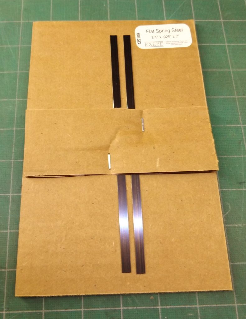
Flat Spring Steel:

Packing flat spring steel safely

These are 7″ pieces of slightly-curved spring steel. Obviously they are hard to pack so that they won’t punch through the package. My solution is to put them on a 5.5″ x 8.5″ cardboard pad with the curve down at the ends, and staple a small piece of cardboard onto the pad to hold them in place. The resulting package is simple to prepare, safe, easy to ship, and convenient for the recipient. I’ve gotten many positive feedback comments about this packaging.

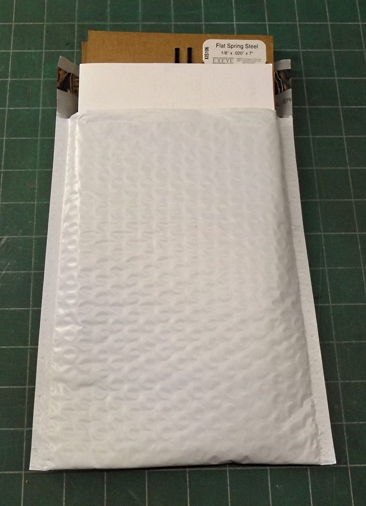
The package ready to seal and ship

This is how the resulting package fits in a #0 bubble bag. The bag will hold one or two items. For three or more I use a #2 bubble bag and use rubber bands to hold them together.

Easy to pack, easy to open, and secure.

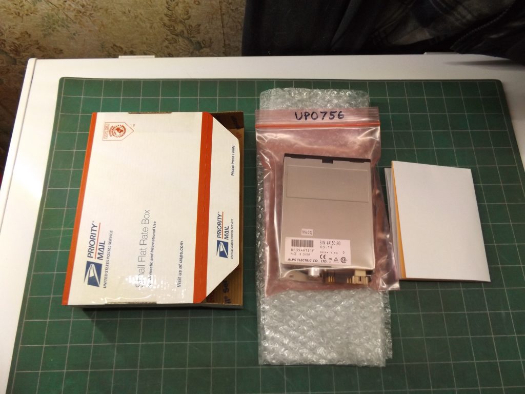
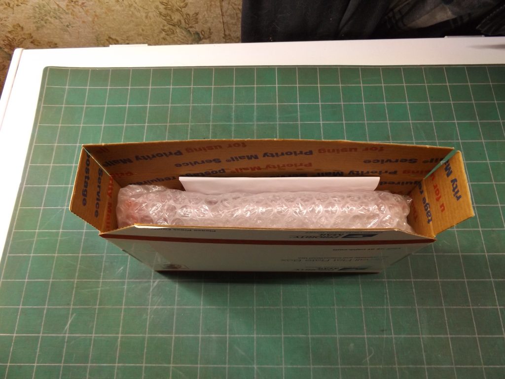
3.5″ Floppy Drives and Hard Drives

Ready to pack

I like to use Small Flat Rate Priority Mail boxes for shipping drives. Most drives are over a pound so First Class is out, but I use them even for drives under a pound because they are easy and safe. You could sometimes save on postage by using a bubble bag or a non-USPS box with Cubic or standard Priority Mail, but you wouldn’t save much, and for me it’s not worth the bother. Also if I shipped many drives I would get fold-up mailers the right size.

I wrap the drive in bubble wrap (no tape) and stuff it in the box along with the packing slip. Note that I do use small strips of tape on the sides of the box; probably not necessary but they make a more secure package, and don’t need to be cut or removed to open it.

Ready to seal

Everything stuffed in the box. All that is left to do is to peel the tape off the adhesive strip, close the box by pressing the adhesive strip well, and apply the label.

The drives fit somewhat loosely in the box, which is fine. Things like this don’t have to be jam-packed full of packing material. It might slide around a bit, but it’s well padded so a little movement in the box doesn’t matter.

With the advent of Ground Advantage, Priority Mail is no longer the cheapest way to ship drives, though I still sometimes use it. Usually I wrap drives in two layers of bubble wrap and put them in a bubble bag. If I’m worried about safety, I put them in a suitable-sized box.

Engineering Malpractice: Ryobi Power Scrubber

P4500 Power Scrubber

I bought one of these on eBay a few weeks ago, to use to clean my aluminum siding in preparation for painting. I paid $60. I got a chance to try it out a few days ago to clean a friend’s deck. It worked quite well for that, for maybe ten minutes. Then it slowed down and stopped, acting like it had run out of battery. I put in a fresh battery, but then when I pressed the switch it just twitched. A second battery did the same.

When I got home I contacted the eBay seller. I asked for a 50% refund and to keep the tool, hoping I could take it apart and fix it. The seller agreed, and sent me $35. I started taking it apart.

Disassembly

Taking the power head apart was fairly straightforward, once you realize that the screw holding the triangular drive has a left-hand thread. Once the cover is off, you end up with a motor with a gearbox/output shaft assembly attached. It separates by turning a lever.

Once you get the gearbox assembly out, you need to remove two layers of planetary gears (keep them organized so you can put them back in the right place). What’s left is the output shaft and bearing in a plastic housing.

Here I got stuck. I couldn’t pound the shaft out, so I put it in a press. That broke the housing, changing the project from an attempted repair to an autopsy. It turns out that there is a snap ring holding it together, hidden behind a rubber seal. To take it apart, use a small hook to pull the seal out, then remove the snap ring. Here is the assembly:

Output shaft assembly
Diagnosis

It became pretty clear that it was a bearing failure. There is a one-piece steel sleeve bearing running on a steel shaft with no lubrication. It is guaranteed to seize up within minutes. It is hard to believe that this design passed quality control and was released to manufacturing. Anyone with any experience working with machines would know that it would fail immediately.

If you look at the Home Depot site, you’ll see that about half the reviews describe a failure like this one. My guess is that the other half is people who haven’t used it enough to have it fail. By the way, Home Depot seems to now be blocking negative reviews for this product.

To verify that the steel sleeve bearing was what it appeared to be, I cut it in half with an angle grinder. Sure enough, it is one piece of steel. It is badly galled, with grooves worn in it:

Steel sleeve bearing

And here is the shaft which also has galling:

Output shaft

The shaft is 10mm in diameter, the bearing is 24mm in diameter (I couldn’t be sure about this because I measured it after cutting it — it might be 25mm). The bearing is 13.25mm thick.

Repair

I looked quickly for a sleeve or ball bearing that would exactly fit and didn’t find anything. There may be something out there, or a combination of a brass sleeve bearing and a steel sleeve that would work. You could also drill out the existing bearing to accommodate an available sleeve bearing.

If you can return it to Home Depot you should do that instead of fussing with it.

Brother ML500 Typewriter Repair and Battery Replacement

There is very little information on this electronic typewriter on the web. I’m selling one on eBay and wanted to check the battery (used for the word processing memory and probably for retaining settings). To do so I had to take the thing apart. Here is what I learned.

Opening up the Typewriter

It’s kind of hard to figure out how to get into the typewriter. The case splits in half horizontally and the top part comes off. Once the top part is removed the clear plastic cover is easily removed.

Start by removing two screws near the back.

The case comes off by popping clips starting at the front edge. This is easily started by hand, but there are two bigger clips in the middle of the sides that must be released with a flat tool, like a thin 6″ ruler. Here is the ruler stuck through a small slot at the bottom edge of the bottom half of the case. Insert the ruler under the bottom of the clip and twist and pry, and pop the top part off.

This is what the clip looks like after the top part of the case has been removed:

Once you get the two clips released, lift up the cover from the front and remove it. This is what you’ll see:

The keyboard assembly is held by four clips, two at the bottom edge and two on the lower side at the level of the Shift key:

Release the clips and rotate the bottom of the keyboard up. There are two narrow ribbon cables at the top edge (I didn’t figure out how to disconnect those) and a wide one at the left side which just pulls out of the connector:

Now you’ll see the main circuit board. It’s very 1990s. At the right side is the battery:

It is a 3V CR2354 battery which is soldered in using custom tabs spot-welded onto the battery.

The main circuit board can be unclipped by releasing several tabs. There is a locating pin at the lower left that needs to be cleared by maneuvering the board.

Testing and Replacing the Battery

You can measure the battery voltage with a meter by sliding one probe under the battery and touching the other to the top of the battery. Mine measured 3.17V, which is pretty good for a 20-year-old 3V battery, and I’m not going to try to replace it.

If yours is dead or you just want to install a fresh one, the first step is to unsolder the existing battery in three places. Remove the old battery.

You can’t get an exact replacement. One possibility is a Panasonic CR2354 battery with leads spot-welded on, but in a different configuration from the old battery. It might fit in the existing PC board holes, and is probably worth a try.

Another option is to get a battery holder and connect it up with short leads so it sits to the right of the PC board. I would get a CR2032 holder and use a CR2032 battery, which is also 3V and is readily available. You can also get a CR2354 holder and a bare CR2354 battery.

Be sure to get the polarity of the new battery right. Wrap the new battery and holder in tape or shrink tubing so it doesn’t short out on the metal bottom of the keyboard.

User’s Manual

You need the user’s manual to use any of the many fancy features of this typewriter. It’s about 120 pages. I found one on one of those manuals sites. It’s not a very good copy but here it is:

Adding Fonts in Ghostscript

I use a program that produces Postscript and allows use of non-standard Postscript fonts. I wanted to figure out how to get Ghostscript to load those fonts so I could produce a PDF file from the Postscript. Should be simple, eh? Well it took me a week of trolling message boards, studying documentation, and trying things before I figured out what was going on.

Part of the problem was that there are multiple versions of Ghostscript that work differently, and much of the “help” you find with a Google search applies to versions other than the one you are using. I am working with the latest version of Ghostscript (as of 2/9/21), version 9.53.3. If you are using an earlier version, upgrade. If you’re using Ghostscript with some other program that requires a certain early version of Ghostscript, I can’t help. Things have changed a lot with how fonts are loaded.

I’m using Windows 10. It probably works differently on other platforms.

Paths and Directories

There seem to be a lot of directories that Ghostscript looks at. You can see a list by typing “gs -h” (or whatever your Ghostscript executable is) at the command line. Ignore it — I don’t know what Ghostscript looks for in those directories, but it isn’t fonts.

The Fontmap.gs file

If you get deep into this, you’ll eventually come to the conclusion that the key to getting fonts working is the Fontmap file. There are lots of them — the one that’s supposedly used is Init\Fontmap.gs. Ignore it, and don’t change it. It won’t accomplish what you want, even if it seems like it should.

If you really want to try to use the Fontmap file, you’ll find that Ghostscript probably isn’t reading it. To get it to be read, use the

“-sFONTMAP#C:\Program Files\gs\gs9.53.3\Resource\Init\Fontmap.gs”

parameter. Use the quotes since there’s a space in the parameter. Use “#” instead of “=” because they say you should.

But take my advice and don’t.

The FONTPATH Parameter

The key to all this is the FONTPATH parameter. It specifies where Ghostscript should look for font files. Ghostscript doesn’t seem to read font files unless you specify this. Once you do, everything will start working.

I suggest that you put all your fonts, regardless of the type, in the Windows Fonts directory. Note that Ghostscript will use Truetype fonts, so all the fonts in the Fonts directory are available to you. But you can add PFB or other Postscript fonts to that directory — they won’t be available to Windows programs but if you have Postscript that references them, they will get used.

To specify the FONTPATH parameter, use the:

“-sFONTPATH#C:\Windows\Fonts”

parameter. The quotes aren’t needed unless you use a path that has a space in it. The “=” is replaced with a “#” for some reason.

Font Names

Ghostscript uses the font names in the Postscript you are reading, and tries to match them with font names in the font directory specified in the FONTPATH directory. It doesn’t need the Fontmap file to do this.

Be careful about font files that have the same name. You might not get the font you want. This is particularly troublesome when the font you get has different font metrics than the one you want. I don’t know how Ghostscript decides which font to use if there is a name collision.

Summary

So the bottom line is: put all your fonts in the C:Windows\Fonts directory, and use the FONTPATH command line parameter to get Ghostscript to use it. That’s all there is to it.

I know very little about Ghostscript and there are probably others who could help make this article better. Please comment if you have any suggestions. But my purpose is to make it possible to get Ghostscript to load fonts without understanding too much, or being aware of the vast complexity of Ghostscript when it is not necessary to do so. Please keep this goal in mind when commenting.

Thank you!

Update

I’m moving to a new computer so I had to reinstall everything. I couldn’t get Ghostscript to work and (surprise, surprise!) I found my own article when I started searching for help. It helped me figure out what was going on, but some things need clarification.

First, you can’t put non-Truetype fonts in the Windows\Fonts folder any more, so those instructions are no longer always valid. And I’m trying to use old Adobe *.pdb fonts. How I had set it up before was to put the fonts I need in the Ghostscript “Resources\Font” folder, and then added a FONTPATH command line parameter referencing it to my command that invokes Ghostscript. Here’s the parameter I used:

“-sFONTPATH#C:\Program Files\gs\gs10.02.0\Resource\Font”

Note that the path includes the version number of Ghostscript that is being used. If you use a different version (which is probable) you have to use the appropriate version number. You have to remember to change it if you upgrade Ghostscript.

What I’m Using Ghostscript For

In case it might be helpful, I’m using Ghostscript to convert Postscript files created by an old CAD program that doesn’t support Windows printers to PDF files that I can easily print. I have a BAT file to invoke it, named PS2PDF.BAT, which contains the following command (all on one line of course):

gswin64c -sOutputFile#”%2″ -sDEVICE#pdfwrite “-sFONTPATH#C:\Program Files\gs\gs10.02.0\Resource\Font” -dNOPAUSE -dBATCH “%1”

You invoke it with “ps2pdf file1.ps file2.pdf” where “file1.ps” is the input Postscript file (“%1” in the command line), and “file2.pdf” is the output PDF file (“%2” in the command line). The output file must not already exist.

Troubleshooting Zebra/Eltron Label Printers

This article describes some of the troubleshooting tips I’ve discovered for solving problems printing labels with Zebra Eltron label printers.

Power Supply Problems

Most of the label printers you get on eBay come without power supplies. However, other sellers have power supplies that are claimed to be for these printers available for $10 or so, and I’ve bought a lot of them. Everything has been fine until recently when I started having printers fail in a way that points to the power supply.

Some Background

The original OEM power supplies were big bricks rated at 14VAC and 4A. Much to my surprise the power supplies from eBay are rated at 20VDC at 3.25A. My guess is that the original power supplies feed AC to a rectifier directly, and feeding it DC gives the same result without the rectifier having to do anything.

There’s also the issue of 14V vs 20V. Maybe the 14VAC ends up closer to 20VDC after being rectified; I’m not an expert on electronics but 20VDC seems to work. Sort of.

I also don’t know how many amps a rectified 14VAC at 4A becomes when it gets converted to DC

I just ordered a new batch of power supplies and this time they were 20VDC at 2A. I sent them back.

The Failure Mode

At best the printers I sell with 3.25A supplies tend to print lines that cover the full width of the label somewhat washed out. I always thought it was caused by a weak power supply, but it was never bad enough that I was motivated to try to figure it out.

Now, I have several printers that with the 3.25A supplies will print an inch or so of the label then die. The way it dies is that the printer stops, the light on the button goes out, and it makes a strange “burp” noise. The light on the button then comes back on and the printer is back to normal. The light going out momentarily suggests strongly that the printer overtaxed its power supply. It gets about an inch of label printed before this happens.

Failed Label

Another clue: with the 2A supplies it gets a quarter of an inch of label printed before dying the same way. Less current, less label.

I’ve had the same results with several printers and several power supplies. Something is going on.

Capacitors

Inside the printer are two big capacitors, 22000 uF if that means anything to you. The printers are all getting to be 20 years old, so it’s possible that the capacitors are failing. Capacitors store electricity and could be doing two things inside the printer: smoothing out the rectified AC, and building up a reserve of power for doing things like printing wide black lines.

Next Steps

I’ve ordered a 4.5A 20VDC supply to see if it works better. I’ve also ordered a couple of new capacitors, and I’m hoping that they will make the problem go away.

Update 1: I got the new capacitors today, installed them, and the printer still failed the same way. So it isn’t the capacitors. Oh well, I had hoped that would explain things.

Update 2: I tried printing with a bigger (4.74A instead of 3.25A) and the problem went away. So it sounds like this is indeed a power supply problem. But with the “solution” given in the next section, you (and I) can manage just fine with the smaller power supplies.

The Solution

A little careful searching led me to the solution. If you crank the darkness up to the maximum in the printer driver this failure will happen. I had recently tried turning up the darkness. So I backed it off to 12 or so and the problem went away.

The Jaggies

There is a setting in the driver for this printer that controls dithering. This is one of several techniques used to compensate for the low resolution of the printers by smoothing out edges. It’s useful if you are trying to print photographs or low-resolution graphics, but it causes print quality problems when printing labels. Unfortunately the default setting in the driver is for dithering to be on.

It can sometimes be hard to recognize labels with the jaggies. Often the sense is just that things don’t look as good as they should, or that some labels look better than others. The problem is especially acute if you’re trying to print a scanned label. Here is a label, printed with stamps.com software, that has the jaggies:

Label with jaggies

Look especially at the “XI” logo next to the return address. Once you start seeing the jaggies they are all over the place. Now compare the above label with this one, printed with dithering turned off:

Label with dithering turned off
Turning Off Dithering

If you think you have dithering turned on (it’s on by default) it’s easy to check the setting and change it. Get into Printer Preferences for the Zebra Eltron printer (there are many ways to do this, and they vary by which version of Windows you are using). There will be several tabs; pick the Graphics tab. Look for the Dithering section. One of the options will be selected; if the option None isn’t the one selected, select it. Then just pick OK and you’ll be done. Here’s a picture of the dithering settings:

Dithering setting turned off

Reloading Windows XP On Your Old Computer

This is a cautionary tale. Hopefully it will encourage you to not try to install a fresh copy of XP, or if you insist, it will give some hints which will make an impossible project a little less impossible.

So I got an old XP computer given to me and I wanted to sell it on eBay so I had to wipe the hard drive. It didn’t have an OS recovery partition so I just found an old XP CD and reloaded it. That’s where the fun began.

I expected XP to just load and work. But I forgot that back in the XP days you had to load drivers for your computer (or motherboard) and all installed cards, for anything important, like a network card, to work. And of course I didn’t have any of the necessary drivers.

It took two days to find, download, and install the drivers I needed. To download the chipset drivers I had to pry the heatsink off the motherboard chipset chip to read the number off it. (I found out they make thermal compound in cement form for gluing such heatsinks back on.) For other drivers I started with the hardware ID found in Device Manager’s properties and did some serious searching. It also turned out that the Internet Archive (http://archive.org) has a lot of the old driver CDs that came with old motherboards — you don’t need to find the exact same one, if you’re lucky one for the same chipset will work.

At this point it is a good idea to activate Windows. It seems that the online activating service run by Microsoft no longer works, but the phone activating service still does work. It’s a giant PITA but just do it. Eventually the phone activation service will stop as well and we’ll all be stuck. Microsoft originally promised that they would release a patch that would eliminate the need for activation in such a case but I’m not holding my breath.

With the network card driver installed and Windows activated, I was able to start looking for updates through Windows Update. But it wouldn’t work, and Internet Explorer wouldn’t load pretty much any website. I figured out that the encryption certificates loaded with XP were all out of date, and nowadays almost all websites are https, none of which would load without current certificates.

After some fruitless searches for sources of current root certificates, I decided to try to get Windows Update working. I needed to load all available updates anyhow, and Windows Update was where certificates used to come from. That led me to discover that Microsoft has turned off Windows Update for XP, as well as most (or all) other unsupported operating systems. Last time I tried this, years after XP support ended, it still worked. No more.

More searching led me to a website in Germany, http://wsusonline.net. The owner of this site has built a tool for updating Windows computers’ Microsoft software without a network connection. A side benefit of this website is that it has access to old updates for no-longer-supported software like XP. [I don’t know if he has copies of old updates or if he just knows a way to download them from somewhere on Microsoft’s website.] In any case the website will get you the updates you need.

From wsusonline.net, you need to download an update-generating program, run it to generate a folder containing all the updates you want, move that folder to the computer you want to update, and run an included updating program. It sound involved and does take time, but it works. Follow these steps:

  1. On some other computer, download the update-generating program from http://download.wsusoffline.net. There are many versions covering different ranges of software. For XP you want Version 9.1. It’s the last version that supports XP.
  2. Unzip the resulting file and run the program UpdateGenerator.exe. Start by selecting the Legacy Products tab. That will get you into the section for XP updates. It all looks pretty complicated but just pick what you think you need. I suggest selecting all the Internet Explorer and .NET stuff too.
  3. Select the output medium. I tried creating an ISO file first but it didn’t work. So I tried outputting to a USB drive and that did work. I used an 8GB drive and it almost filled it up.
  4. Click Start to generate the updates on the USB drive. It will take a while. I don’t remember if it asks questions during the process but you’ll figure it out.
  5. Move the USB drive to the computer you want to update.
  6. Run the UpdateInstaller.exe program from the USB drive. It will run a long time, it will ask questions, and it will request that you reboot several times.
  7. Keep running UpdateInstaller.exe until it gives an unambiguous message that it has concluded successfully. It takes three or four restarts to be finished.

Now you have a running and updated copy of Windows XP running on your machine. Make an image backup of it (I recommend the Image series from http://terabyteunlimited.com), since you don’t know how long the procedures described here will continue to work.

There is still a problem with encryption. It seems that modern websites, most all of which use HTTPS, require support for encryption standards that XP doesn’t have. There are a few old versions of browsers that do support modern encryption, and I suggest installing Opera 36. I tried to put the install file for it here but WordPress won’t let me upload EXE files, or at least I couldn’t figure out how to. Search for “Opera 36 XP” and you’ll find it.

Opera 36 will load most but not all websites; probably some websites use new features of HTML that the older Opera 36 doesn’t know about. So that (mostly) takes care of web browsing. But there are a lot of other programs that access the internet, and most of them won’t work.

In researching other old computers on eBay that use XP, I found a reference to an open-source browser called K-Meleon (thanks to eBay user bourne588). It’s supposedly designed to run on old versions of Windows and might well be the answer for XP. I haven’t tried it yet but well report here if I do. See http://kmeleonbrowser.org/.

One other consideration is that you won’t be able to get XP-compatible drivers for any modern hardware. One workaround is that XP has drivers for Postscript printers, and some modern printers, like Brother printers and I think some HP printers, will accept Postscript.

So the bottom line is that if you are trying to use your XP machine as a modern computer, it’s not going to work very well, or at all. However, if you’re trying to run an old program designed for XP, especially if it uses special hardware, then you might need to bite the bullet and install XP.